Does this sound familiar? You see a post that interests you on Facebook, let’s say it’s an ad and when you click on on it, it takes you to a page that is seemingly unrelated and has nothing to do with the thing you just read about that made you click on it in the first place.
It takes you a couple of moments to put it together in your mind because they just did not bother ensuring that the look and feel of the landing page was aligned with the ad.
Now, you and I might be willing to spend that time to figure it out and still read through the information on the landing page but the average user now takes less than 3 seconds to make a decision whether they are going to read on or click over to the next thing.
That is a very short amount of time that can be the determining factor between getting the client or the sale. If they are not willing to read on, they are not going to call you and the lead has gone cold.
Your job is to make it easy and convenient for your prospects to connect the dots and ensure they have a seamless experience when they enter your sales funnel.
Last week I promised to give you some tips on how you can ensure a consistent look and feel across all your consumer touch points (social media, your website, landing page, newsletter and other advertising formats you might choose to employ.)
Today we are going to talk about brand integrity so no matter where your prospects see your message they immediately know that it is you.
Here is what this looks like. Let’s say you are getting ready for a launch and your are promoting it with ads on Facebook. You have written compelling copy, selected an engaging image, laser targeted your audience and your ad is ready to go.
When your prospects click on your landing page it should have a similar look and feel in terms of color scheme, fonts, logo, images used and the copy needs to be consistent so it is a seamless transition.
I always scour Facebook for examples and here is a great one I found. I hope Lewis does not mind but it’s just so well executed that I thought I’d share it with you today.
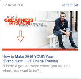
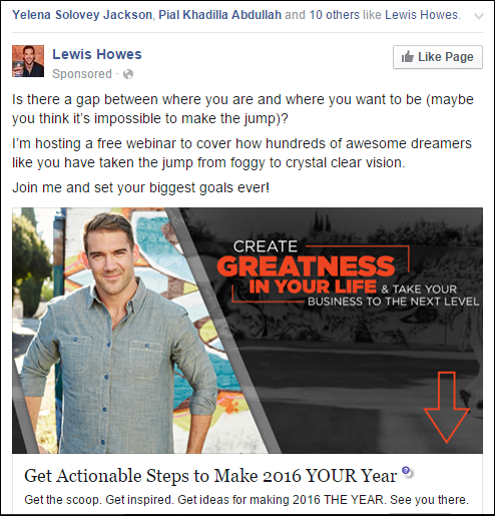
He is running two ads to promote his new program. Picture and copy are slightly different, however you can still immediately tell its him.
Now take a look at the call to action and name of the program. Very consistent in both ads and if I might add very nice touch to use that arrow directing the viewer to the core message about the new live training he has coming up.
When you click through to the landing page, you see that the look and feel of it is extremely consistent. This is what I mean by a seamless transition or ensuring brand integrity.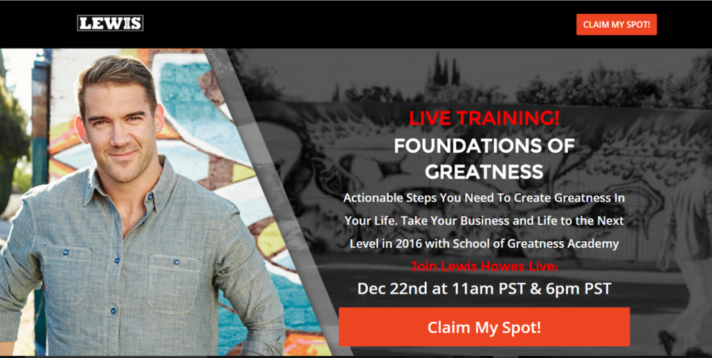
There is absolutely no second guessing, you immediately know who it is, what it is about and what benefits you will be able to get out of attending this training.
Followed up by a strong call to action to “claim your spot”. If you have ever been on one of Lewis’ webinars you know you want to sign up early because they do fill up quickly.
This is a perfect example of how to get it right.
I am sure by now you are on to me that I am taking you through the top of the sales funnel. Starting with Facebook Ads that click through to a landing page where you promote a live training tied to your offer which ultimately will be the platform for you to sell a higher-end program that might or might not require phone enrollment (like a coaching package or an event/training.)
Stay tuned for next week’s blog where I will go over how you can create a killer landing page that promotes your offer so your prospects will sign up or pick up the phone and call you to find out more. I am going to break down all the steps how you can set it up in just minutes using a simple yet effective tool.
Much love,
Simona